Feedback is one of the most powerful influencers that enhances student achievement (Hattie, 1999). Yet, be aware, feedback is not simply a letter grade or percentage. A simple label as “Good job” does not provide students with opportunities to further learning. Feedback must be rich by providing students with information about his/ her performance related to the goal of the assignment. Rich feedback provides students with the opportunity to self-reflect for improvement. Self-reflection guides students in deriving ideas on how to meet a goal with the provided feedback from the instructor. Self-reflection can be as simple as posing a question, such as “Your paragraph seems more like an opinion. Do you feel that adding data would support your stand?”
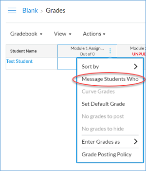
Canvas gradebook provides an efficient way for instructors to provide rich feedback to students by sending an automated notification to students who meet a certain criteria. In Grades, click the ellipsis next to the assignment.
Criteria options include students who
Haven’t been graded
Scored less than (points / percentage)
Scored more than (points / percentage)
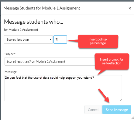
To further a student’s learning, ensure that a prompt for self-reflection is provided in the Message area.
For students who have scored less than a score/ percentage, use a message to summarize criteria needed to meet instructor expectations on an assignment.
For students who have scored higher than a score/ percentage, use a message to affirm a continuance in effort to meet instructor expectations.
For students who haven’t submitted, use a message as a reminder.
As an instructor, conduct your own self-reflection. To get started, consider this prompt, “What could I do to help students who are having difficulty with meeting instructor expectations on an assignment?”
We have all heard about the importance of first impressions. Well, that is most important, when it comes to teaching an online class. To make the most of a first impression, create an introduction video to show who you are and why you are excited to teach the class. Better yet, a video displays you, as a human, not just a “person behind the curtain”. It doesn’t need to be a big production; most modern computers have webcams and microphones built-in. Also, our department helps if you want to make it a big production. To make an excellent first impression, consider the following:
Who are you.
Background, why you are an expert.
What you expectations of the class are.
Something fun about you.
Welcome them to the class.
The first thing the student sees is your face, which will help them make a connection! Start with introducing yourself. Your name is a great place to start. Next, give a description about your background. How long have you been teaching? Where did you go to school? Where have you worked in the past that is relevant to the field you are teaching in?
Once they know who you are, lay down some essential groundwork for what your expectations are for the class. Nothing major is needed; just an overarching idea of the course and how it relates to their studies. For example, I had one teacher use her Introduction video as a step to help students by clarifying the second-week assignment. The instructor showed examples of what past students had missed on the assignment and clarified her expectations in the first assignment.
Share something personal, such as a hobby, or home/family life. This step isn’t needed, but it is something to help your students get to know you a little bit.
The final step is to welcome them to the class with a closing statement.
Things to think about when you are making an introduction video. Keep it short! Anything over two minutes in video format, and you are start losing a lot of people’s attention. Audio quality is more important than video quality. People will watch a grainy video rather than a video that is inaudible. Have fun!
Whether you’re color coding an email to your students, or adding some eye-catching elements to your Canvas page, it’s important to be intentional with your color choices. Good use of color can pull together the visual side of your work, but a bad use of color could draw away any viewer from what you’re trying to communicate.
The good thing is, you don’t have to have an arts degree to be great at using color. In this blog post, I’ll be sharing a few tricks and tools you can easily apply to your work.
Create a palette
Let’s go back a bit and pretend we’re back in grade school, picking out a recess activity. Your two options at the moment are a Paint by Numbers project, and a coloring book – comparing the two, which feels more intimidating? The coloring book, right? The limitless options for color can feel like a drag, and keep us from starting on what’s most important. With the Paint by Numbers project, we can get started right away knowing everything is laid out for us.
Now, we hardly ever have a project that lays out all the colors we must use. This doesn’t mean we can’t create those colors for ourselves. Before you get started on any piece of work, you can simplify the amount of time you spend experimenting on multiple colors by creating your own “Paint the Numbers” with a palette.
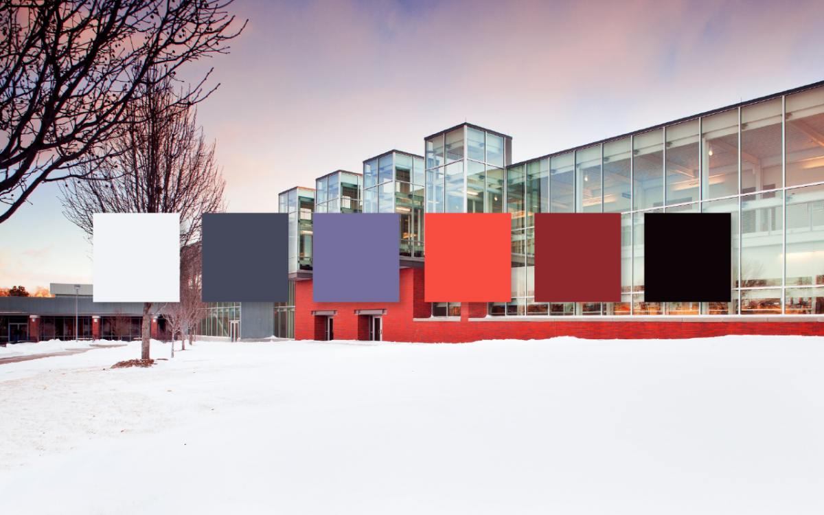
There’s not really any rules for creating your own palette, but a good range to start in is somewhere between 4-6 colors. Usually, having one color that’s dark enough to serve as a text color, and one color that’s light enough to be a background color or a text color on a dark background is important to include. The other 2-4 colors all depend on what you’re creating for.
For example, here’s a quick palette I made, what I determined each color to be, and how it could be applied:
Creating successful palettes on the first try is a skill that takes time to perfect, but the good news is, you don’t have to rely on your own discretion to always create perfect palettes, which brings me to my second tip.
Use a palette generator tool
The internet is full of great resources for help with colors, including palette generators and communities where you can pull a palette that fits just what you need. My personal favoite is a tool called Coolors. Coolors is completely free to use. The site not only includes a wide variety of user-generated palettes for you to use, but allows you to plug in your own color and create random palettes until you get the one you want. Check out this tutorial to see what you can do with Coolors:
If you’re a fan of less color options, Color Hunt offers a similar service with just four colors to choose from.
Drop in colors from an image
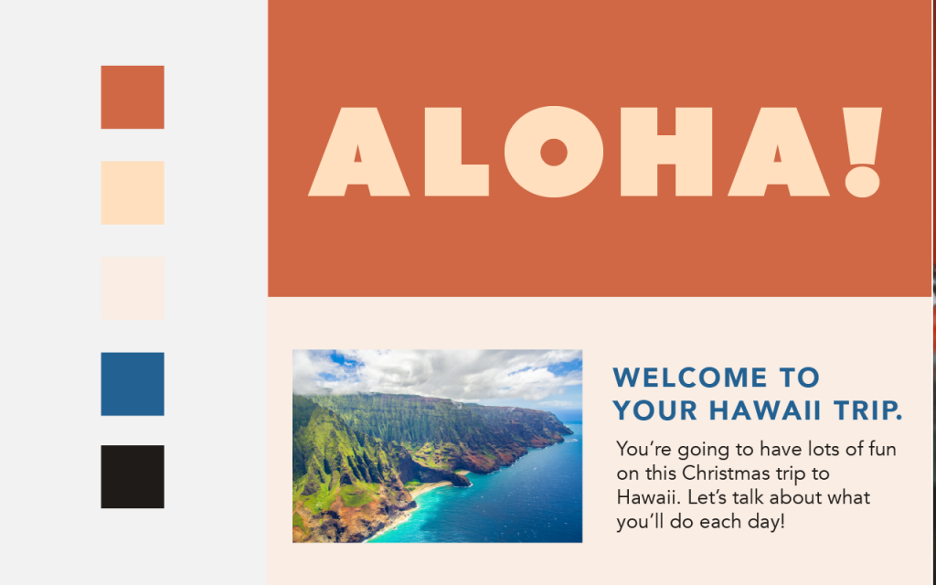
Like the tutorial for Coolors mentioned in the features, dropping colors from an image you like can also be a great way to produce a palette. You can use automated tools like Coolors to help you create an image-based palette, or create your own with an eyedropper tool in Adobe and Microsoft software. It’s easy – even in Microsoft Word, you can add in an image into your document, click the text color option in bar on the top left, click “more colors”, and choose the eyedropper tool to create your own palette.
For this example, I browsed the popular stock photo site, Pexels for an image to drag and drop colors from. Keeping in mind my text and background color rules, I stuck to a simple four color palette for this example. Again, this example isn’t perfect, but it shows how good photography can be used within your work and serve as a starting point for your color palette.
You can browse stock photo sites like Pexels and Unsplash for imagery to use, or take your own photos and save them to your desktop. Good inspiration is anywhere – some perfect examples include brightly colored buildings, floral arrangements, public murals, and animals at the zoo, just to name a few. The options are limitless!
Be wary of poor color combinations
My last tip for this post is to give a word of warning about poor color combinations. I encourage you to experiment with color, but always keep in mind readability and user experience when using a palette. Your viewer should always be able to read your text, discern all elements within a project, and your project should be visually balanced in order to not overwhelm or underwhelm your viewer. Not all palettes are perfect, so be sure to test them before applying them all over your work, only to realize the combinations don’t work and you have to restart from the beginning.
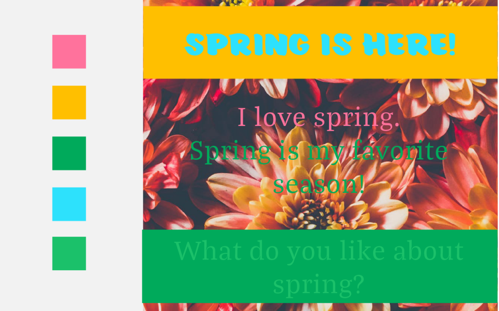
In this example, I’m going to show you a bad palette that could be poorly applied, and how I fixed it for my example.
Hopefully, you’d never see an example like this out in the wild, but these are some mistakes that can be easily avoided with careful detail and attention. A few things to note about this one:
In the header, the color for “Spring is Here!” doesn’t provide enough contrast from the yellow, and would be difficult for anyone to read. You should always provide enough contrast between your font color and background color to make it easily readable.
The text overlaid on top of the flower picture is difficult to read – not only because of the light font weight, but both the green and pink are difficult to read. Keeping areas of text the same font color is important to group them together. Putting text on top of an image is also risky, as it’s often unreadable in images such as this with so much going on within it.
In the final section with the two green colors, the text color is too similar to the background color. You rarely ever need two colors to be almost identical within a palette, and you should never combine them like this, as it makes it extremely difficult to read.
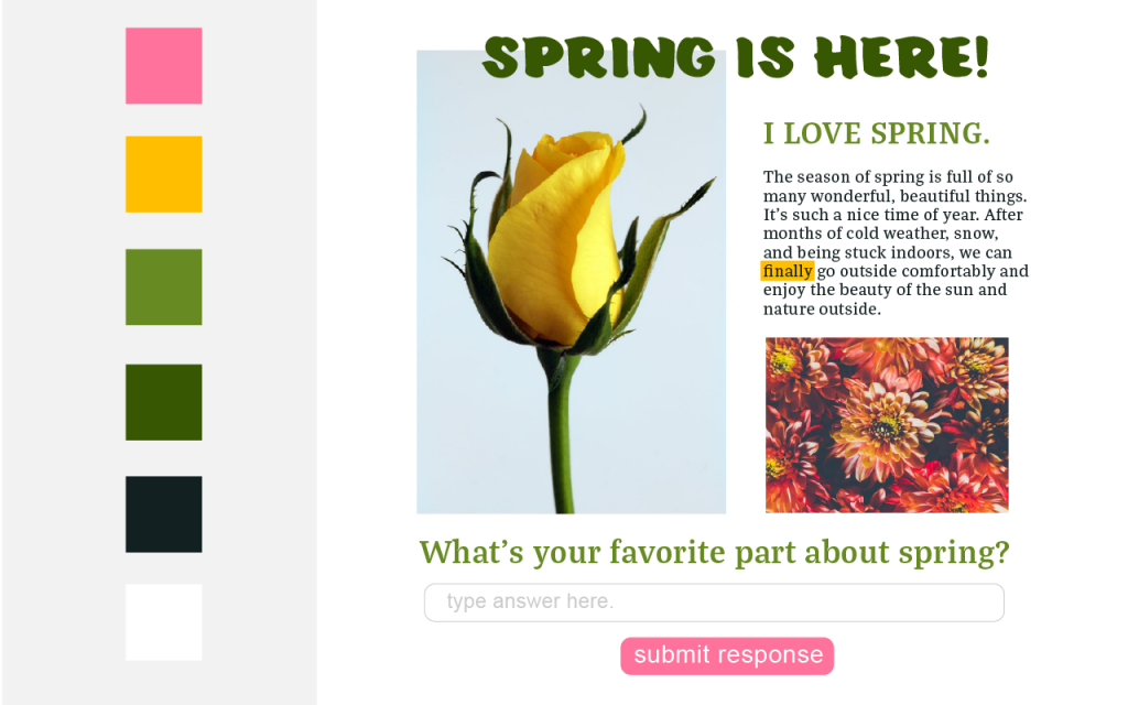
Now, here’s the new and improved version of this palette and layout. It’s a very simple example, but I stripped out some of the colors and replaced them with new options that provided more contrast for text and headers. I color-dropped the two new greens from the tulip image I got from Pexels. This way, the colors in my design matched my images, and were also more readable. I grabbed a new tulip image to show you can overlay text, but try to choose images with white space you can easily provide contrast against. While you may not use the accent pink and yellow too much, there are two small examples of how you can provide visual contrast in something as simple as a web page like this. For example, I made my button pink to bring the viewer’s eye to that area. I used the yellow as a highlight as well, for important text I wanted to highlight or emphasize.
While this list doesn’t cover all the bases for best using color in your design work, this is a great start if you’re color-wary, or want some easy tips to make your work stand out more. Don’t be afraid to experiment and try unique combinations! And as always, if you need some help on a project, seeking color-related advice or not, feel free to reach out to IDS for help or advice.
What questions do you have about using color in your work? What topics in design are you curious about and want to learn more from? Feel free to comment below with any questions you have – they might make it into one of the next IDS blog posts!